"Shine Online"
Examples of Bad Website Design that Would Make Customers Leave Your Ecommerce Store
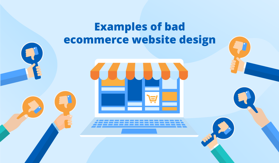
Just as neat, customer-oriented website design of your online store can boost sales, objectively bad design can cut them drastically. A variety of mistakes can lead to discouraged customers who won’t engage with your web store and convert due to poor customer experience.
In this article, I use three illustrative examples to highlight the design elements that repel customers and decrease the conversion potential of an ecommerce website.
Uninformative content
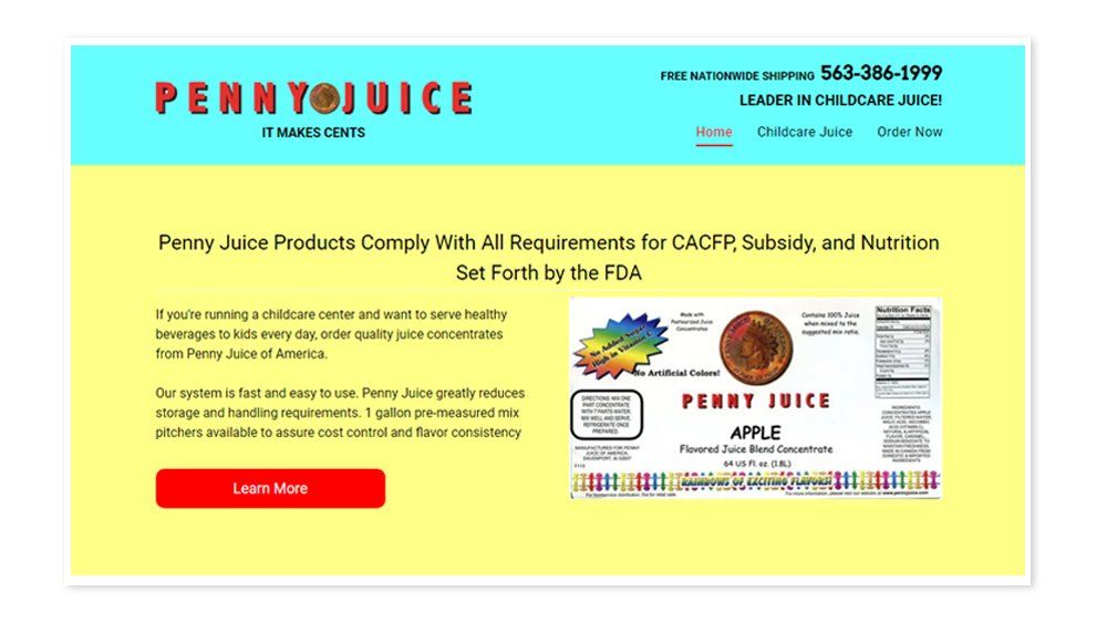
The website of the juice seller Pennyjuice exemplifies a decision to leave customers uninformed. Its design raises quite a few questions starting from why their product is designed specifically for childcare facilities and ending with what are the ingredients of the juice. After an exhausting search, you can find some answers in one of the pictures, but its quality and size do not allow you to get the details.
Be careful to avoid: If customers can’t figure out what your product is and how to buy it, they are likely to turn to other businesses with more information provided.
Tangled ordering process
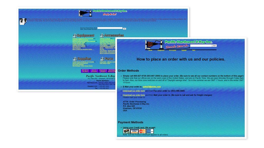
This site has a questionable color scheme that distracts the attention of customers from important CTAs. Though products have fairly clear descriptions and specifications, the problem comes with the ordering process. The website lacks a shopping cart and a straightforward checkout page, and a retailer offers more complicated options for ordering, including unnecessarily multistep ones like downloading an order form, printing it, and sending it by mail.
Be careful to avoid: If a customer decides to buy with an online store and can’t make a quick order directly on the site, they will likely leave.
Overwhelming visuals and puzzling navigation
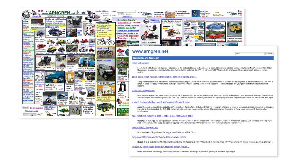
The website of the Norwegian online retailer Arngren collects the majority of design mistakes mentioned above. Some products are accompanied by a price, and some products are not, which results in difficulties with connecting items to their prices. There’s also a confusing website layout with non-uniform font styles and colors, which makes online shopping a real headache. Plenty of graphics make the website less responsive and increase loading speed up to several seconds.
Navigation remains wanting as well. The links to categories in the index section lead either to single products or groups of different goods, and the search results are difficult to compare as they do not appear with product photos, prices, or clear descriptions.
Be careful to avoid: Obstacles in the shopping process can make customers abandon your online store and never return again.
How to avoid web design mistakes?
Let’s follow common mistakes stated above with ScienceSoft’s ways to put things right.
- Uninformative content ⇒ Clear product pages with specifications and quality design elements (videos, graphics, etc.) that communicate your brand.
- Tangled ordering process ⇒ A shopping cart with a straightforward online checkout process as the fastest order method.
- Overwhelming visuals ⇒ Moderate usage of videos and graphics that accentuates the quality of your products and does not kill loading speed.
- Puzzling navigation ⇒ Noticeable navigation menu with logical categories and operational search that gives adequate information on products on the results page.
Good ecommerce website design is a customer-friendly one
As sales depend directly on customer experience, the worst-performing online store websites are those that ignore a customer’s wish to navigate smoothly through the shopping journey. You can learn from others’ mistakes and give thought to your customers when building an ecommerce website. And if you already have an online store, you may consider redesigning it to ensure a positive customer experience.
Econcept, Inc. has a solid experience in ecommerce implementation and UX and UI design, so, whether you need to create a converting web store, or wonder whether your website adversely affects customer experience, ask our team.
Register for 805 Reviews. Get your business listed for FREE. Promote your event, business, deals, and much more. This is a mobile APP and Website that is a MUST HAVE